Fortest
Fortest is an automated regression testing platform, purpose-built for Infor M3 and CloudSuite, designed to dramatically improve ERP testing speed, accuracy, and reliability by leveraging open-source tools and an Infor-specific library. As part of Fortude’s in-house design team, I led the development of Fortest’s brand identity and supported its successful market launch.
SERVICES
Creative Direction, Visual Identity

Design Approach
One of Fortest’s core strengths is its speed and accuracy. By reducing test cycles by up to 90% through its innovative algorithms and architecture, Fortest empowers customers to accelerate time-to-market while maintaining smooth, continuous operations through ongoing automated test cycles. This core idea of precision and momentum is visually reflected in the primary brand mark and icon, capturing Fortest’s promise of fast, reliable performance.

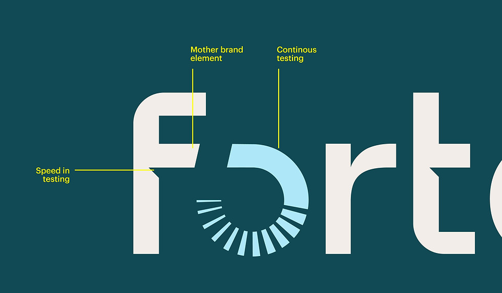

Brand Icon
The “O” element in the Fortest logo is a striking visual feature that encapsulates the brand’s essence of precision and innovation. Designed as a segmented circular form, it symbolizes progress, iteration, and the cyclical nature of testing and improvement—core aspects of Fortest’s purpose in automated regression testing. The radiating segments suggest motion, automation, and the seamless execution of tests, reflecting the efficiency Fortest brings to software testing processes.


Visual Language
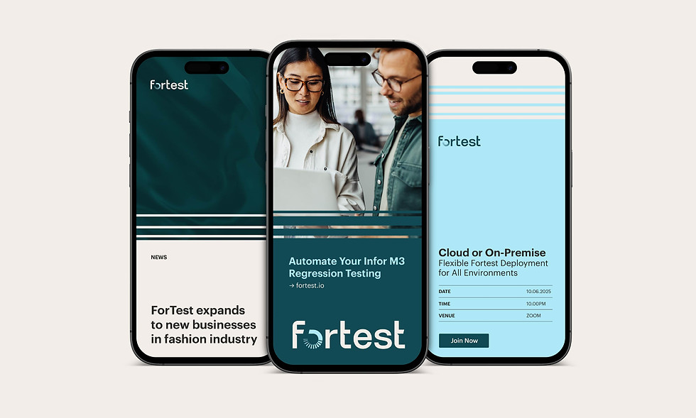
The visual identity was inspired by Fortest’s core promise: speed and continuous testing. Using a system of dynamic lines with varying thicknesses, the graphic language visually captures the momentum and precision behind the product. These lines interact with the content, revealing key areas and creating a sense of movement throughout the design. This approach was applied consistently across all touchpoints — from digital interfaces to print collateral — building a cohesive and distinctive brand experience.